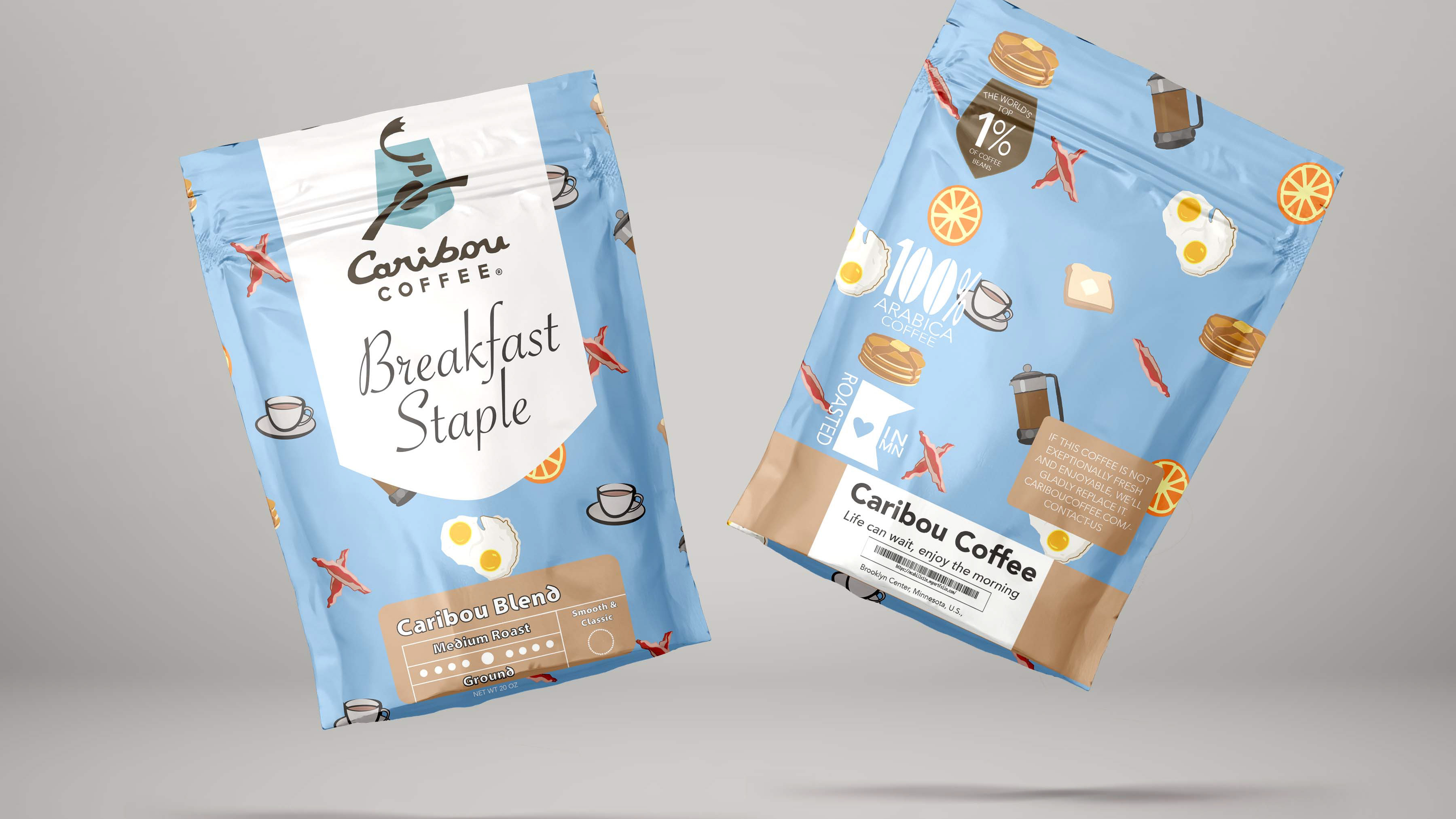
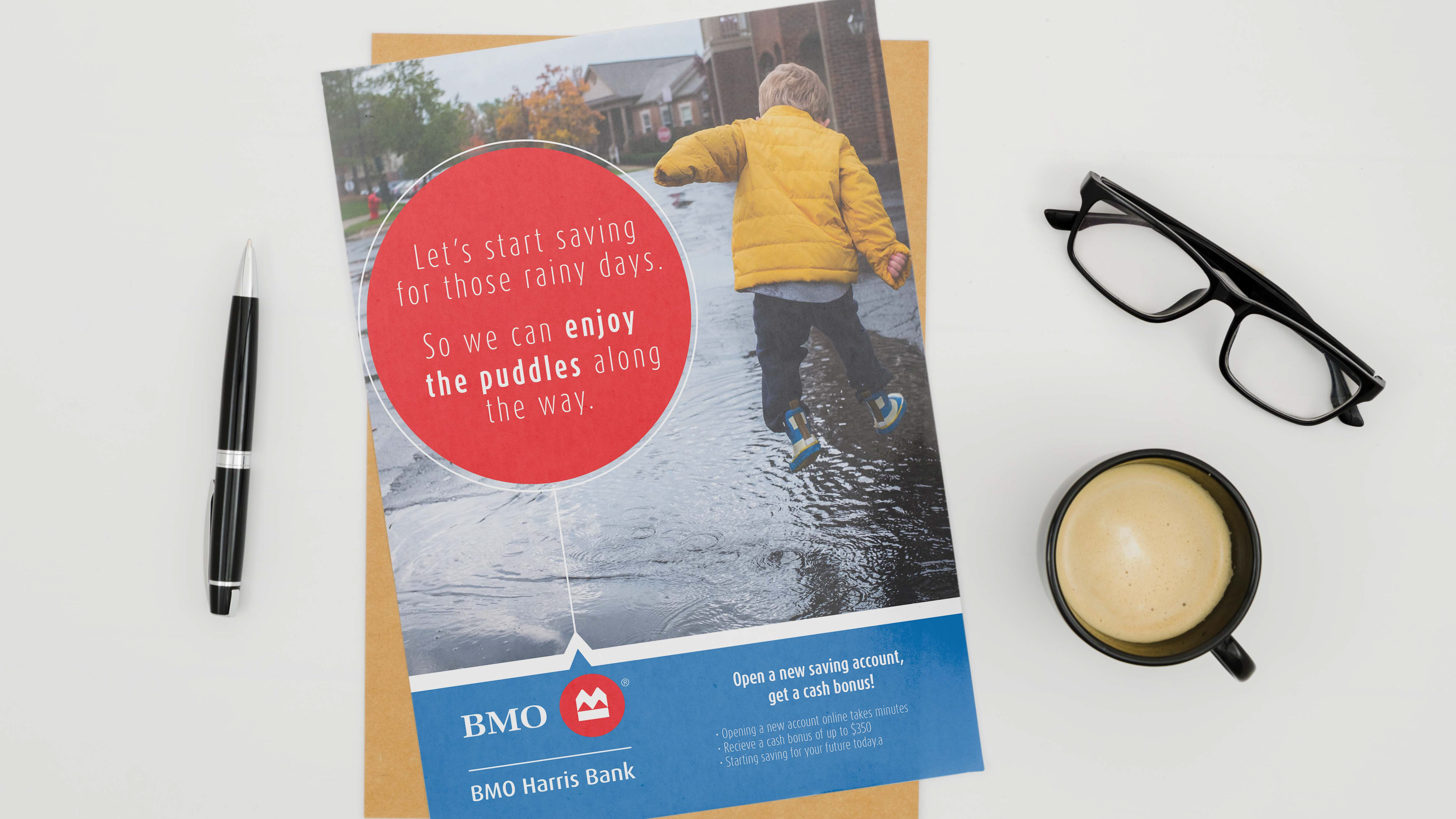
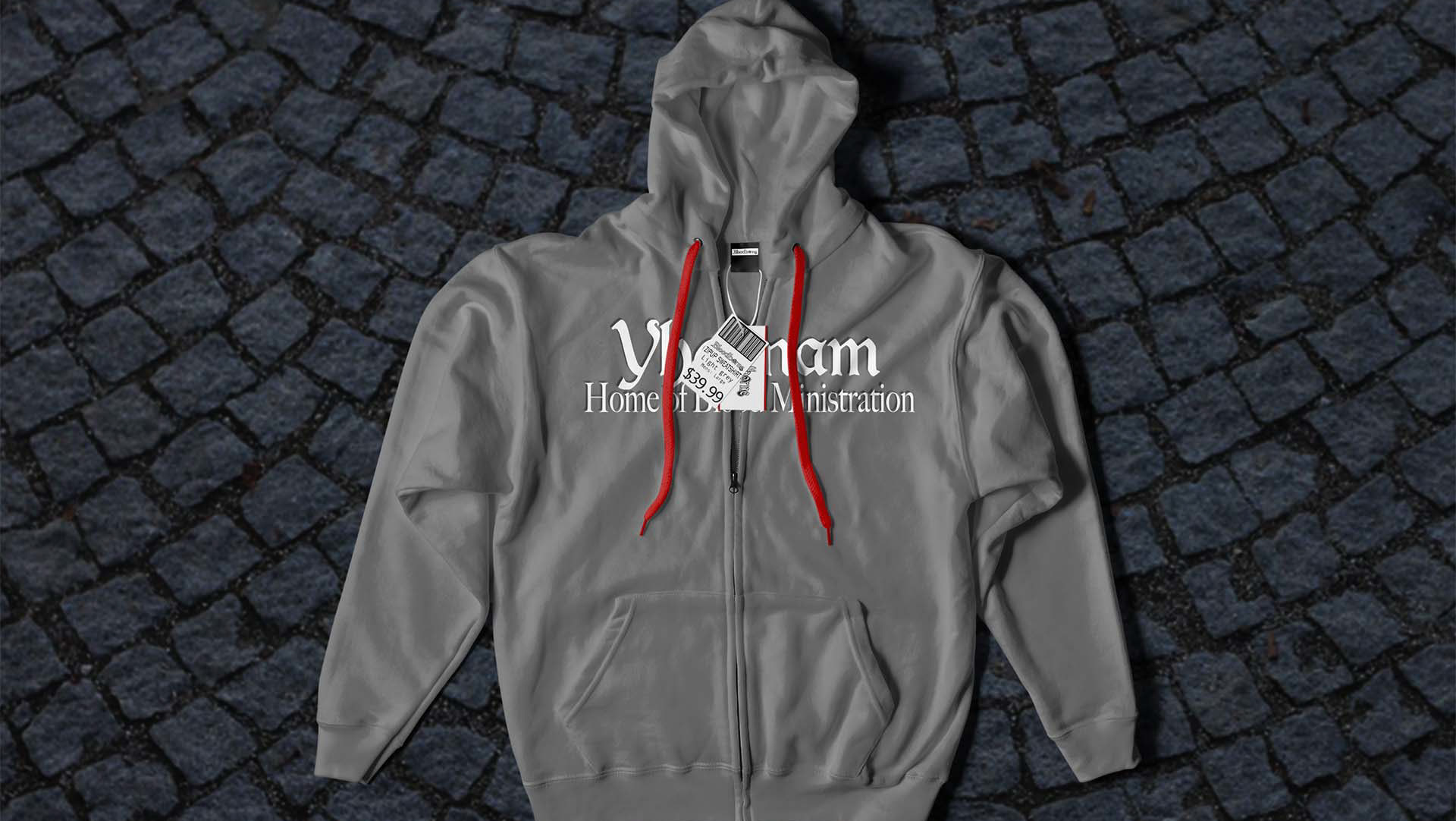
Finalized Mockup, I think it turned out nicely, it is warm, inviting, and a little hopeful.
Website in a standard net format 1920 x 1080.
Smaller iphone 428 x 296 format
While their website already shows a sort of comfy feeling to me it felt more old hat a bit dated and not quite what a current generation thinks of comfortable so I thought why fix what isn't broken and went with refining their own creative process.
The other thought was to shoot for more of a active vibrant branding Though in the end my roughs looked more like a website for a tractor company to me rather than a coffee company. though I do like the idea behind this, I may come back to it in the future.
